People first. Money second.
SNS has been transitioning from a traditional bank to an entrepreneurial bank and therefore during a major repositioning. As such, a shift is taking place from 'cozy families' to 'people with dreams and ambitions who want to move forward'. This new repositioning will be reflected not only in the offline campaigns, but also in all SNS digital channels.
In the new campaign, the main focus is on people before money. The new pay-off therefore reads 'First people. Then the money'. With this new campaign, SNS wants to reach a new target group, the so-called 'upwardly mobile'. This target group consists of young people (18–35-year-olds) with an entrepreneurial nature and with dreams and ambitions. In short, people who want to grow. The beauty of the new SNS campaign is that the brand grows with this target group. A fresh brand with a new face - but with a familiar focus on people that makes SNS so special.
The project
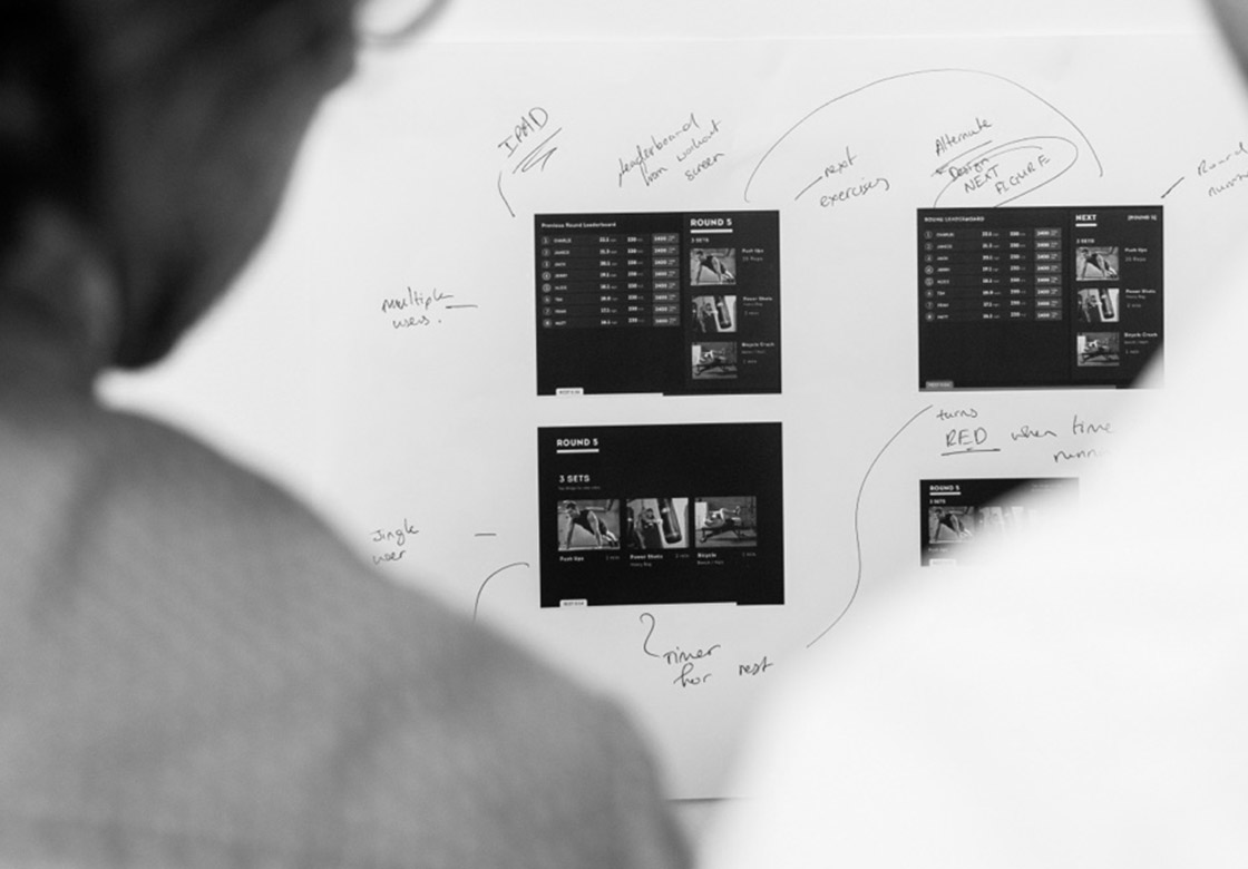
In a corporate organisation like SNS, implementing a new corporate identity is a complicated process. In a short time, we translated the essence of the campaign and associated brand identity into a digital expression. The enthusiasm about the new look & feel was soon palpable within the organisation. We were given a lot of freedom in our design choices, which is a nice way of working for a designer.
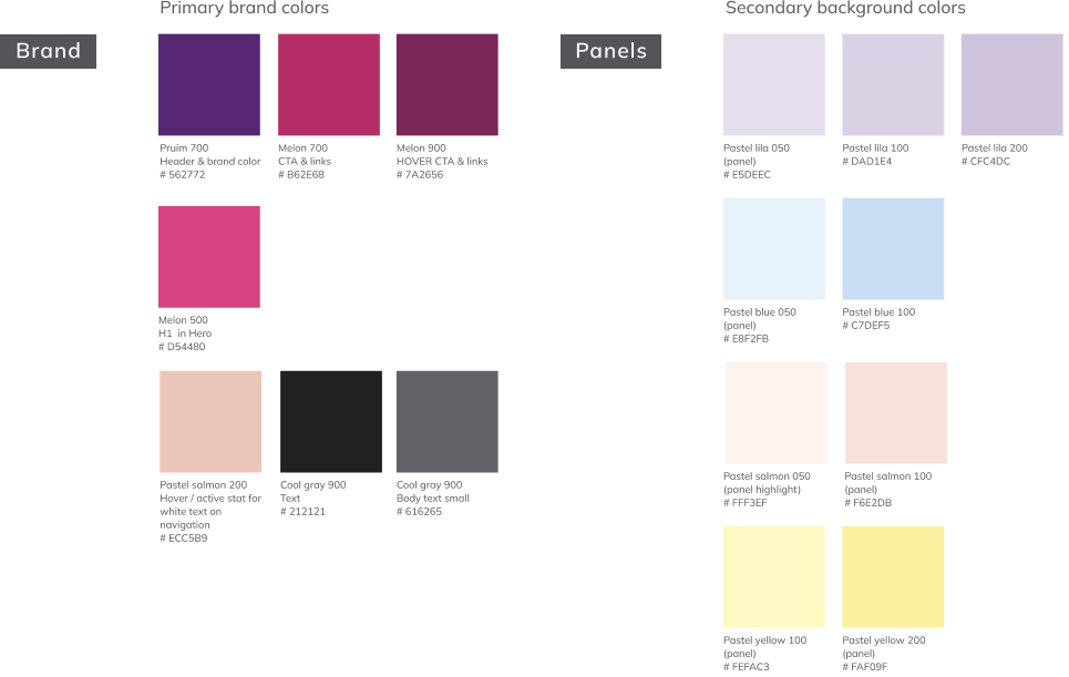
Apart from the SNS logo and the familiar SNS colour purple, we were allowed to adapt the entire digital house style. We were instructed to adapt certain crucial visual elements from the new brand identity and campaign, making them usable in the digital environment. E.g., using the headers with the growth bar elements, an accessible colour palette (following WCAG guidelines) and choosing a body text font that is easy to read and fits well with the new identity.
Volksbank design system
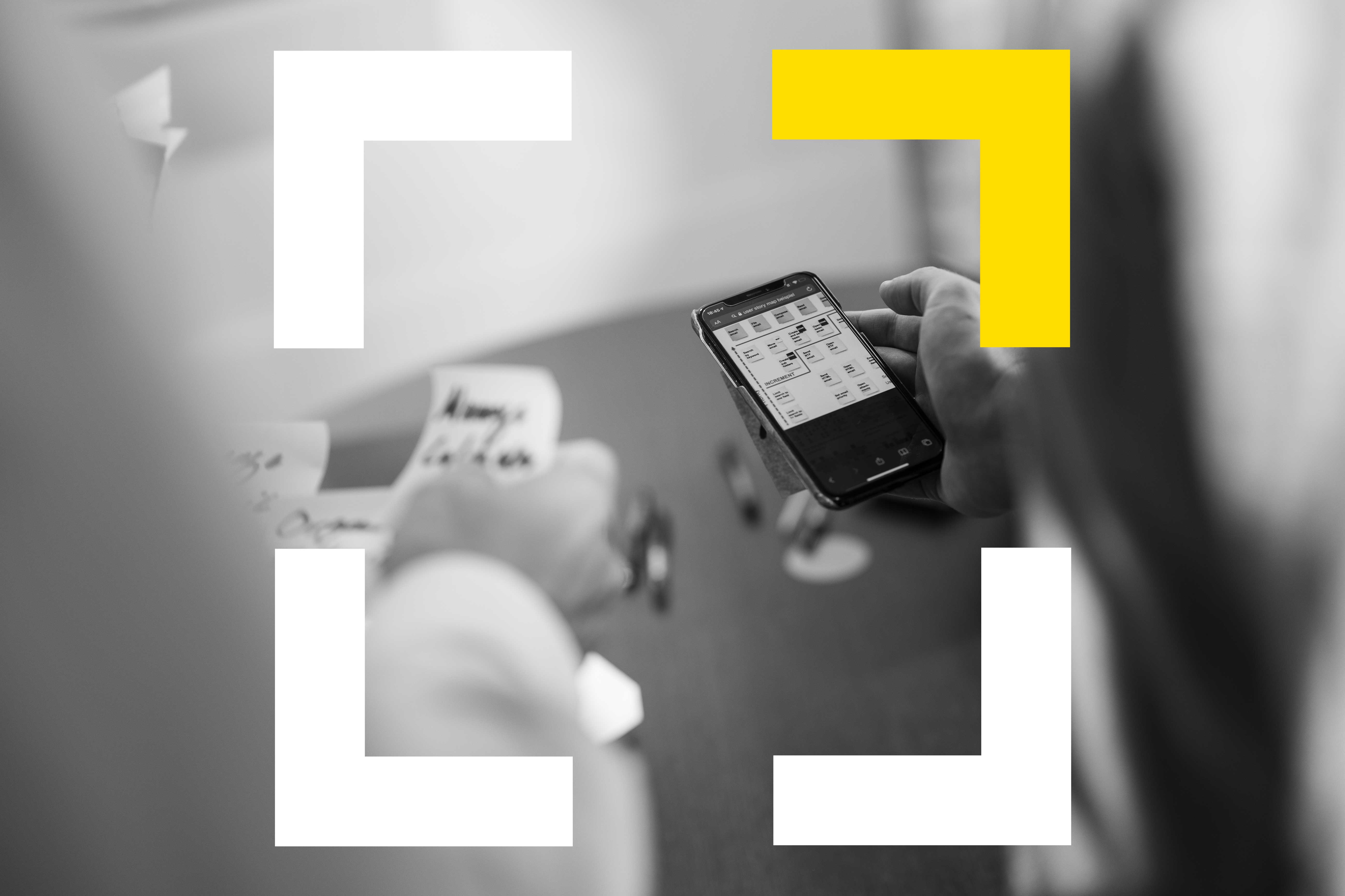
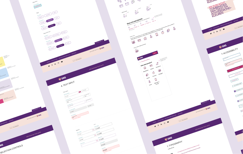
A big advantage we had was working with the Volksbank Design System (VDS) that allowed us to launch the new design quickly and efficiently across channels. In this design system, elements and components are defined and together with the colour palette and fonts, form a visual language that defines buttons, interactive form elements, navigation, grid and many other components which makes them quick and easy to adapt to the new style.
Because design and development work closely together within the organisation using this design system, consistency in building the components and products is guaranteed. Which is very important for the user experience. Another advantage is that a design can be converted from one central place.
The core values of SNS 2.0
Before we got to work on restyling digital channels, we drew up a set of core design values. The new digital look and feel had to comply with these:
1. Positively activistic
As a bank, we want to take a stand. We have an opinion.
We are a social bank, valuing people.
And we fight for that too. But always in a positive way. That is, we take a stand, but we also provide solutions.
2. Human
We are the human bank. With genuine attention. For good reason we are the bank that opens shops where other banks close branches. The starting point for everything we do - including our communications - is always people. In the campaign, we put our customers on a pedestal, not our products.
3. No-nonsense
If we put people at the centre of our communications, we must also speak a human language. Simple, clear language - not "banking language". Visually, too, we speak a human language. With catchy photography that portrays people in a real and striking way in their own world.
4. Forward-looking
If you want to be a positive activist, you have to be a bit ahead of the pack. So, we will always look for a way to do things differently and in a modern fashion. Visually communicating, but also in product development. If we want to help people, we have to change the world a bit.
5. Energetic
We will always try to ensure an enthusiastic, compelling tone. Our target audience wants to move forward, and so do we. Our communication needs to radiate that. It should make you feel like it. Go-go-go!
At SNS we pay special attention to user accessibility. It is required that our designs are accessible to all users and must comply with WCAG 2.1 rules, with a minimum level AA. This entails text and buttons must be easy to read, that there is sufficient contrast between text and background colours and people with visual impairments should also be able to navigate through them.
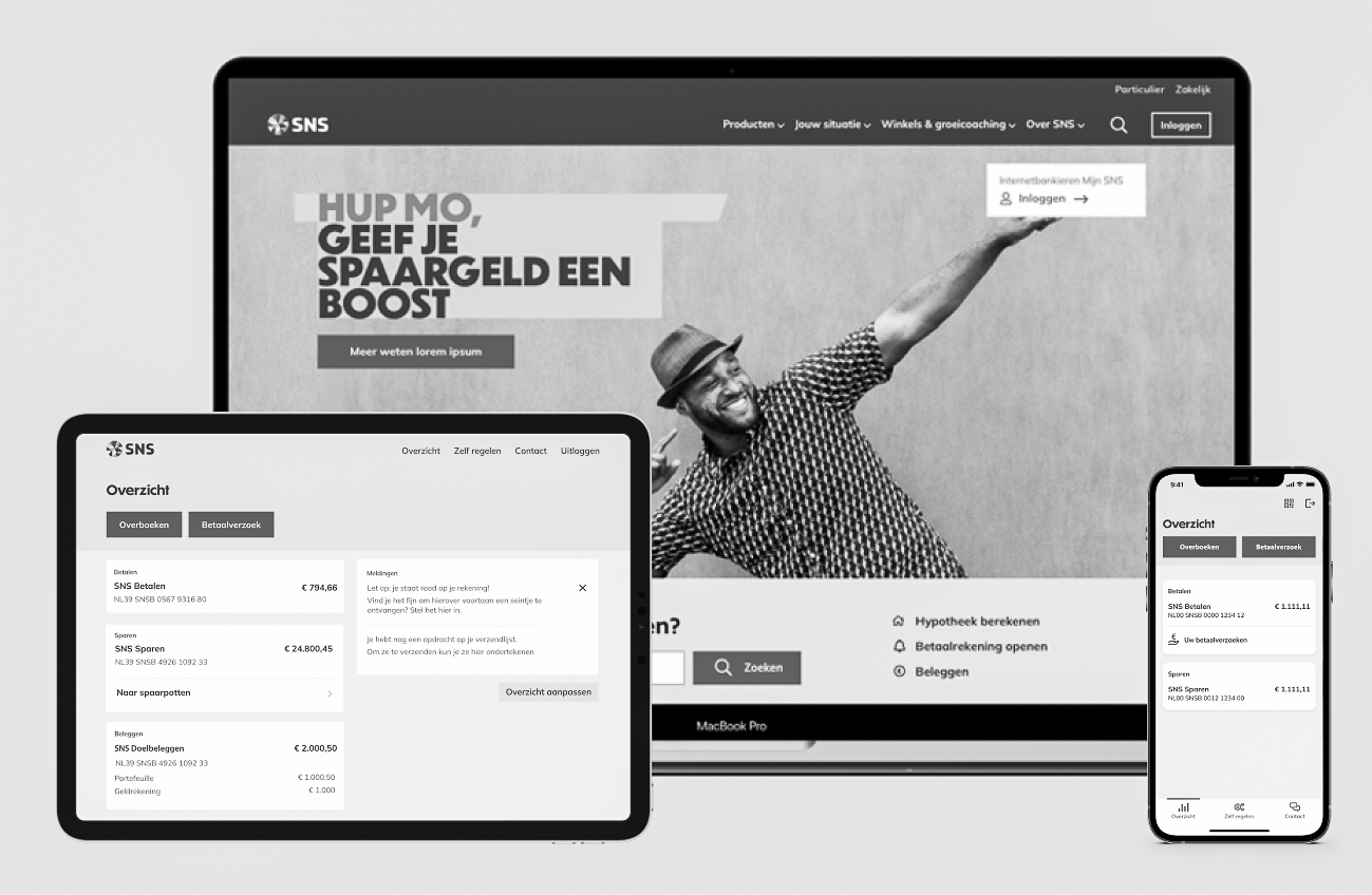
A new visual style
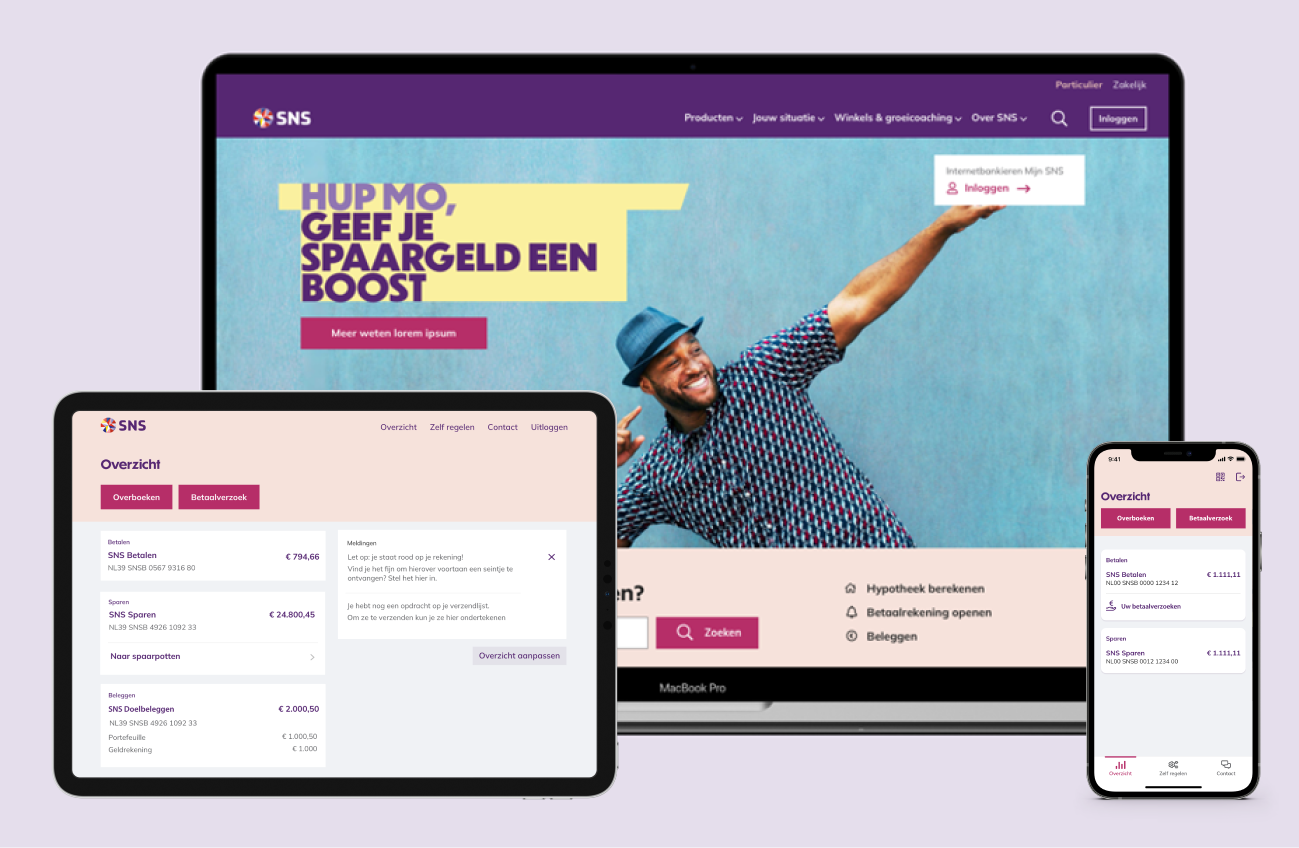
SNS's new visual style itself should tell the story where we put human growth at the center, rather than fringe financial issues.. We therefore put an expressive photographic style, pronounced fonts and fresh pastel tones at the centre of our design, and the shading behind the titles depicts growth bars. To this, we added a distinctive rectangular element an eye-catching and approachable call-to-action colour.
Typography that stands out
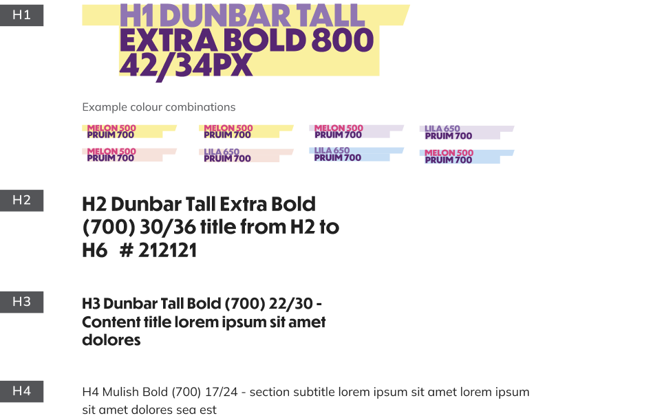
In the early stages of this project, we set to work on defining the fonts. Most importantly, we wanted a pronounced font for the headings and an easy-to-read font for the normal texts. For the headings, we therefore chose Dunbar Tall. This is a distinctive font that fits well with the new design direction we want to take with SNS, conveying powerful messages in a human and friendly way. Behind the titles, we even added a coloured background (lilac, salmon pink and light blue) to depict human growth. We chose the matching Mulish font for the body text. This is a Google font that is easy to read and use on any device and browser. It also fits well with the look and feel of the new brand.
Colour palette
The new colour palette had to feel fresh while conveying the 'new' SNS feel. This means the recognisable SNS purple had to recur. You can see it in the menu bar and the footer. But because we didn't want to make the palette too purple, we expanded it with the pastel shades (salmon, light blue, lilac and light yellow) that we mainly use as background colours.
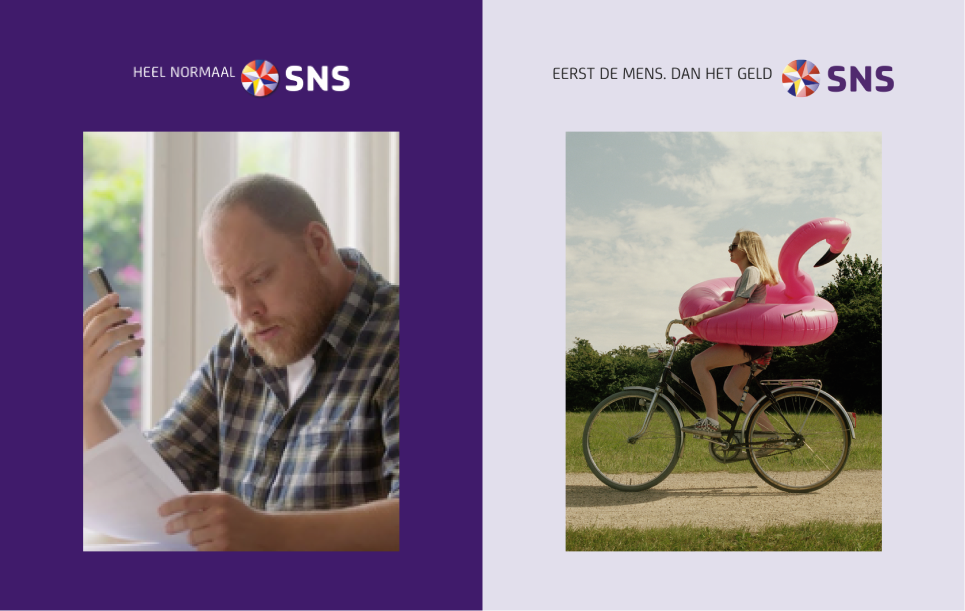
From traditional to dynamic photography
A picture often says a lot more than a thousand words, so photography is one of the most important changes in the new style. It immediately sets an atmosphere. We switched from traditional photography to a more dynamic, urban-style photography. You will no longer see the average Joe (Bart), but rather the positive and sportsy Yara. This photography style is reflected throughout the website.
In short, we opted for an expressive and strong photographic style where people naturally come first. A visual identity that uses photography to convince people of the bank’s personal attention. This way, we really put centre stage human beings, whom we are serving.
Not only the photography, but also the illustration style was tackled considerably. We wanted a recognisable illustrative style that would stand out from regular image banks. This illustrative style obviously had to fit into the new look and feel of SNS. So, you see fresh and colourful illustrations across all channels.
Curious?
Take a quick look at the SNS Bank website. If you would like to know more about how we worked, feel free to get in touch! And don't hesitate to leave us your feedback or suggestions.
Throughout this project, we collaborated closely with advertising agency Alfred, design agency UNKL and illustrator Ming.