

Our Client
a.s.r. is the Dutch insurance company for all types of insurance. Via the a.s.r., Ditzo, Europeesche Verzekeringen and Ardanta brands a.s.r. offers a wide range of financial products covering non-life, life and income protection insurance, group and individual pensions, health insurance, and travel and leisure, funeral insurance and mortgages. In addition, a.s.r. invests in developing and operating real estate.
ASR Nederland N.V. has been listed on Euronext Amsterdam since 10 June 2016.
The Challenge
a.s.r. provides pension schemes for various SMEs, large businesses and pension funds. Clients can access data on the pensions product and participants through a Pensions Dashboard web application.
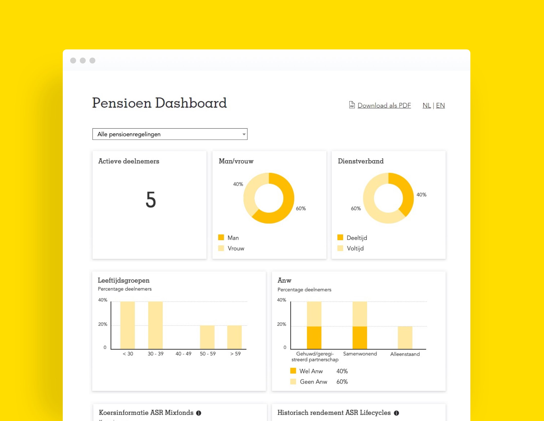
Originally the dashboard showed only simple data on a limited number of tiles. As more detailed data became available we supported an a.s.r. scrum team. The aim was to display more complex information in an attractive easy-to-use format for clients.
Our Solution
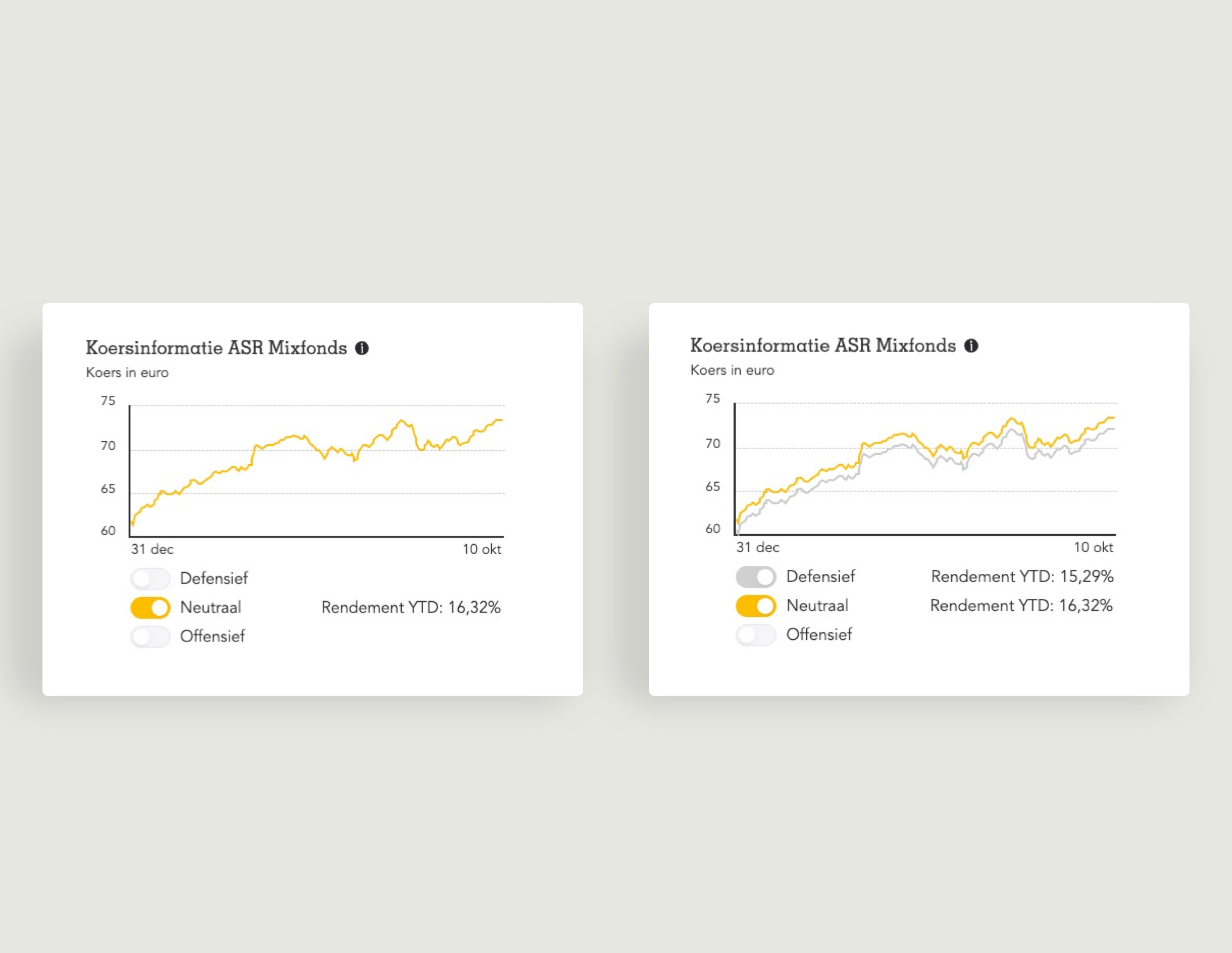
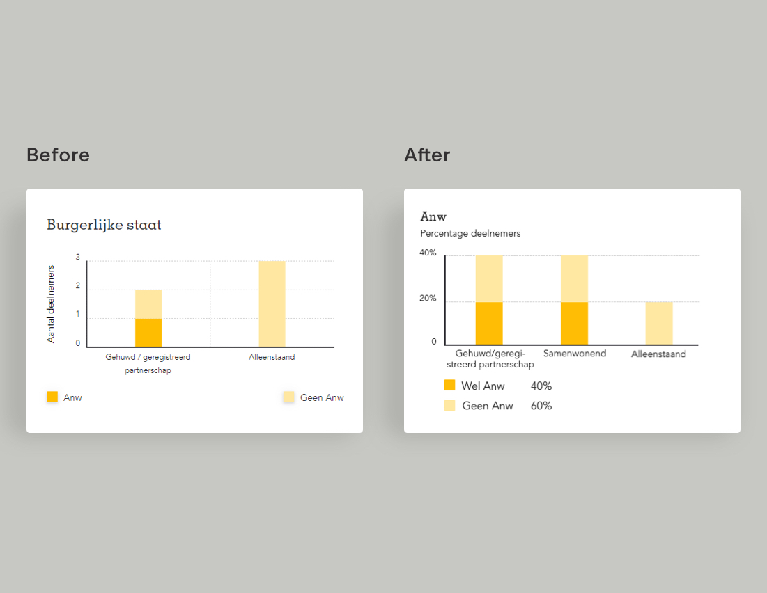
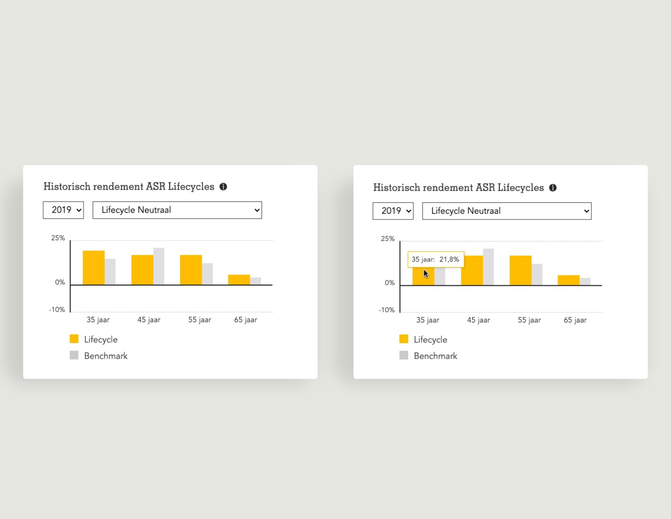
We designed new easy-to-read tiles in which the form of the graphic simplifies the complexity of the information. Only the most relevant information is displayed but the client can also access more complex underlying data.
The house style of the original dashboard is respected but we expanded the design style so that they provide relevant insights into more detailed data.
Keen did a great job creating a design that shows what our data are telling us. It's user-friendly and respects brand guidelines.”

Process
Our approach
We worked closely with the pensions marketing department to establish the specific client requirements. After introductory talks we presented our design proposals and further refined them on the basis of feedback from a.s.r. pensions clients. We also worked with a visual designer, business analyst and front-end developer from a.s.r.
Making design choices that benefit the customer
As a designer you have may choices to make to visualise data for the customer. There are many kinds of graphics to display information. Which one you choose to use depends on the question that the data must answer. So we did thorough research into different forms and their functions. We trialed lots of variants to see what worked and asked people to test the variants and explain what the graphic is showing.
We looked at ways to represent only the most relevant information in the tile but also give users an option to get more detailed information. For instance by clicking an INFO button or moving the mouse over the graphic. The interplay between visual and text was another important element. Something as ‘simple’ as changing a caption along a vertical axis to an easy-to-read horizontal header above the graphic can make all the difference to user experience.


Explore further